The abundance of information in the 21st century has spread to every aspect of our lives and demands that we use it wisely. Whether you are a salesperson, biologist or a business consultant, you should be equipped with the skills to analyze data and mine useful insights from it, often by examining charts and metrics to answer important questions. On the one hand, creating a good chart is no easy task, but, on the other hand, metrics cannot completely convey the behavior from data sets. In this post, we will give you motivation and go over the best practices for creating valuable charts.
A valuable plot intuitively speaks for itself
Python has a very diverse and rich set of visualization libraries to help us creating a valuable plot. In this post, we will go over some of them, including Matplotlib, Seaborn and Mpld3. First and foremost, we need to understand the value derived from plotting data and define what a “valuable plot” is. To answer this question, let’s take a look at John Snow’s (no, not the Game of Thrones’ John Snow) map from 1854.
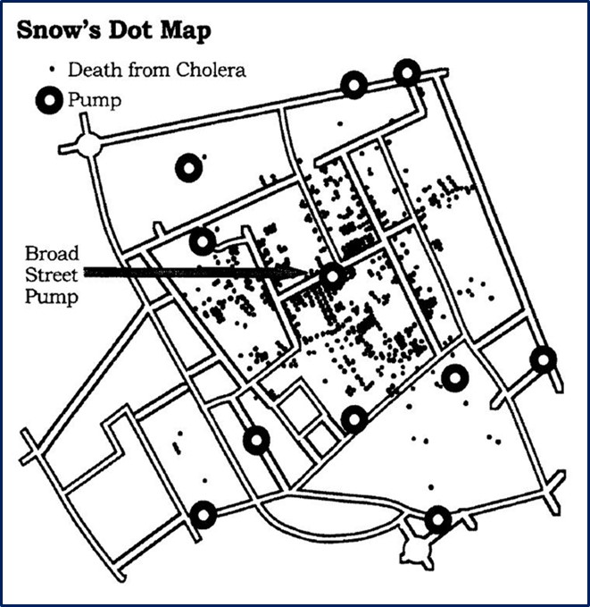
John Snow was a British doctor that investigated the eruption of cholera disease in the streets of London. The main hypothesis of the time was that cholera was caused by air pollution, called ‘bad air’ or even ‘night air’. However, John suspected it was related to the city’s water pumps. So, he mapped the deaths, identifying each death as a bar, and marked the water pumps. It became apparent that the cases were clustered around the pump on Broad Street. Removing the handle of the pump prevented any more of the infected water from being collected and ended the disease.
This is an example of a valuable plot – one that can tell a story in a language that everyone can understand. In other words, this plot is intuitive and doesn’t require further explanation. John began with a question at hand, and his plot gave him a very clear answer.
The Importance of the Question-at-Hand
In order to have a successful plot, we should have a question at hand that we hope our plot can reply to. In the case of John Snow, his question was, “assuming that a water pump is contaminated and spread the cholera, which pump is the main cause?” If you think about the plot without this question in mind, you could arrive at many different conclusions. Here is a toy example to emphasize the importance of having a question at hand, before approaching which plot to make.
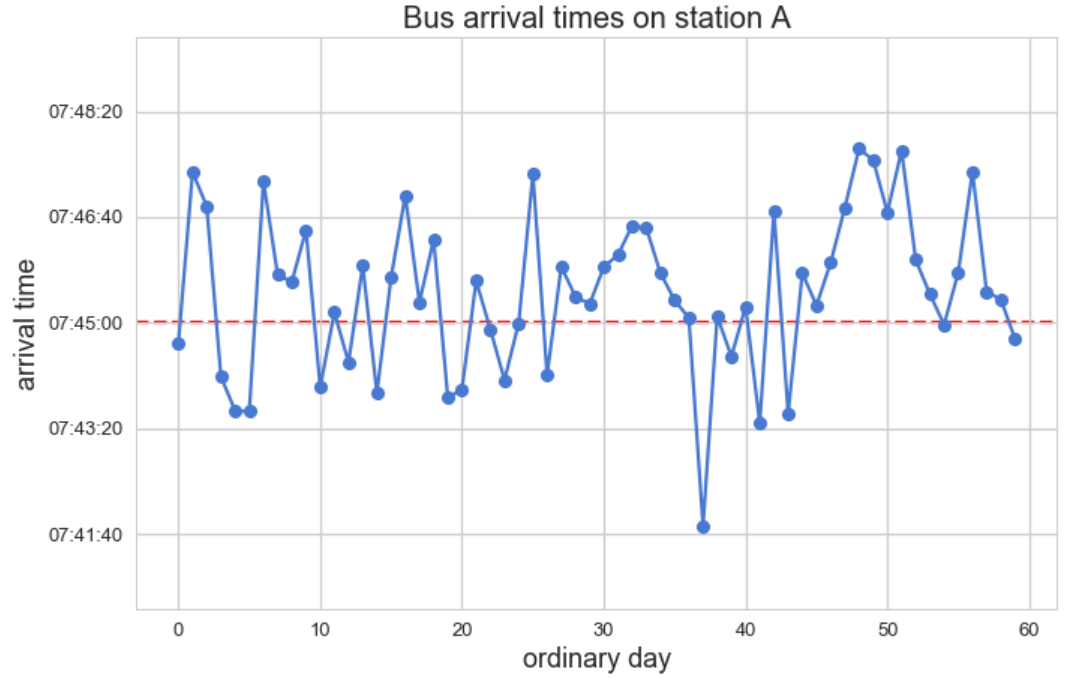
Our data is simply the bus arrival times for a specific bus station over 60 days. As you can see, it varies around 7:45, which is the official expected arrival time.

If we were to plot this dataset in a naïve way, it could be a connected dotted chart, where x-axis stands for the ordinary day, and the y-axis for the arrival time. Since we began with no question at hand, it is not obvious what we are expecting to learn from it.
Now, let’s take a look at it while presenting different questions, and see how they affect the chart format.
Assuming we are the bus coordinator, we would be interested in the distribution of arrival times, with a focus on measuring arrival punctuality. So, the appropriate plot would be the following:
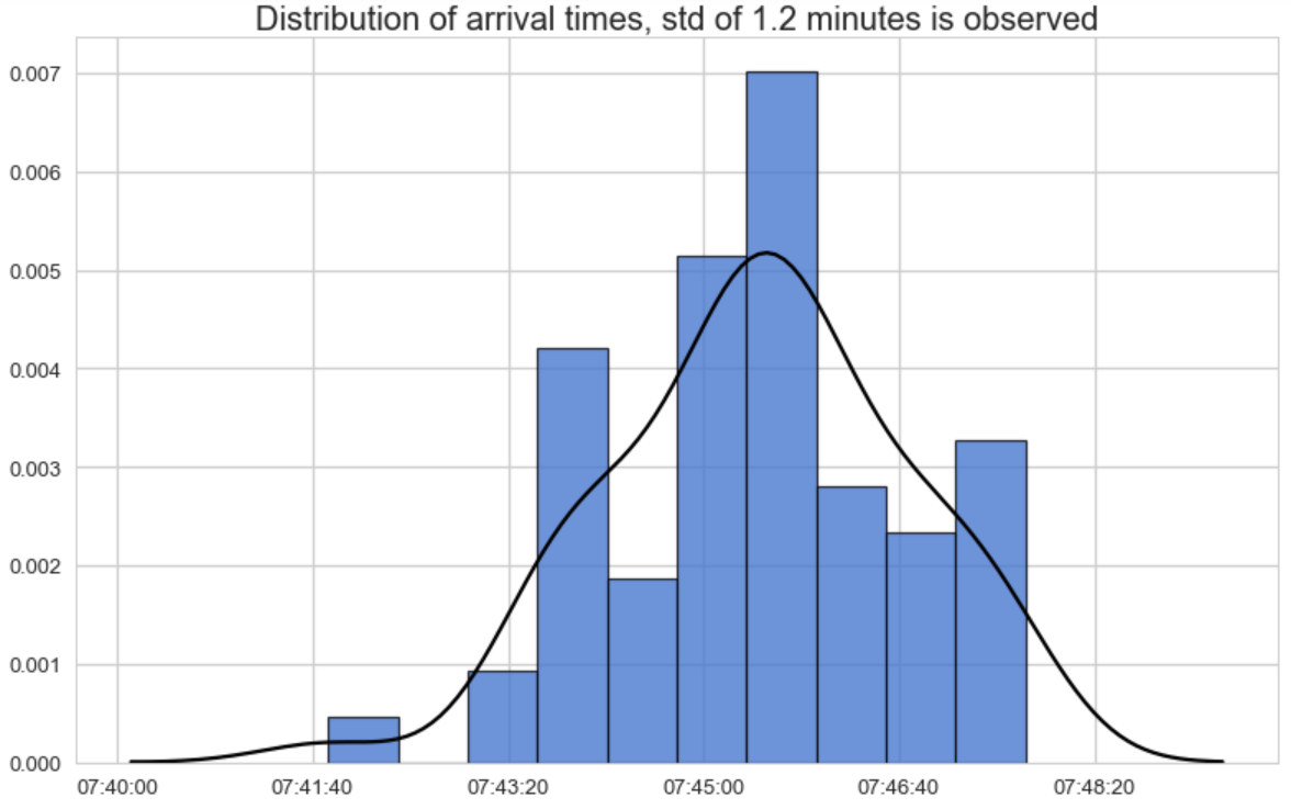
The bus coordinator would expect to see a concentration of arrival times around the expected time (7:45) with a small variance as possible.
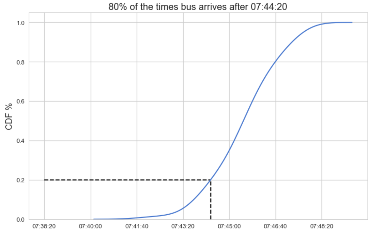
If we were a passenger, we would ask ourselves when we should get to the bus station, so that we will be able to catch it at least 80% of the time. For this purpose, we should use the Cumulative Density Function plot that will help us understand when should we arrive at the bus as a function of its probability:
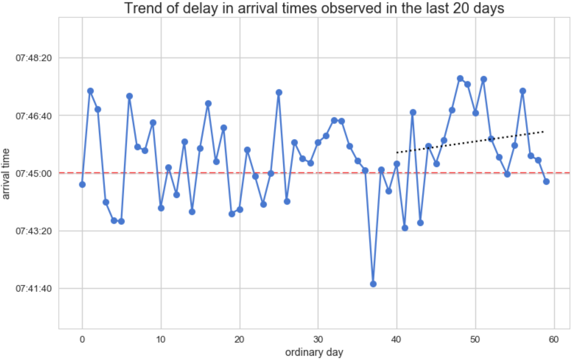
As a decision maker that wants to measure traffic impact on the arrival time in the last 20 days, we should use the plot chart again, this time adding regression fitted dashed line for the last 20 days:
To conclude, we just saw how tabular data is being visualized differently according to the question at hand.
From here on, we will go over interesting use cases that emphasize the importance of having questions at hand and creating plots that answer them intuitively. All of the examples are made using Python, and I implore you to consider it as a friend and not an enemy.
Use Cases
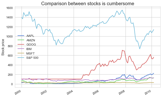
Relative change in stock values is better than absolute values
When investors examine stock data, they are interested in comparing stock profitability. Plotting potential stock values in a timeline is not a good idea, since (a) stocks may have different value scales and (b) the interest is in the relative change (in percentages) rather than the absolute value of the stocks:
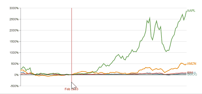
A better plot would include the % change relative to the same selected index point for each stock. It is an interactive plot (implemented using Vega) enabling the user to choose any point in time as the index, and normalizing stock changes accordingly. Observing this plot simplifies the decision on what stock to invest, according to the chosen starting time:
Animation and Interactive plots to compare two scatter plots
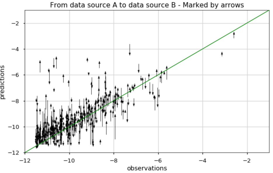
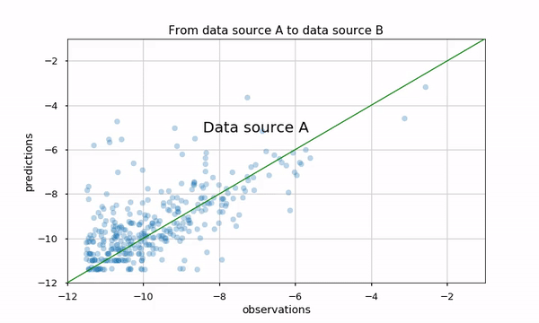
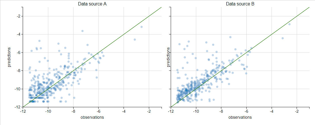
Our task here is to evaluate the logarithm of Daily Active Users (DAU) for an application with a regression model. The results are presented using a scatter plot (predicted versus real value) in two data sources (A and B). We are interested in comparing these two scatter plots
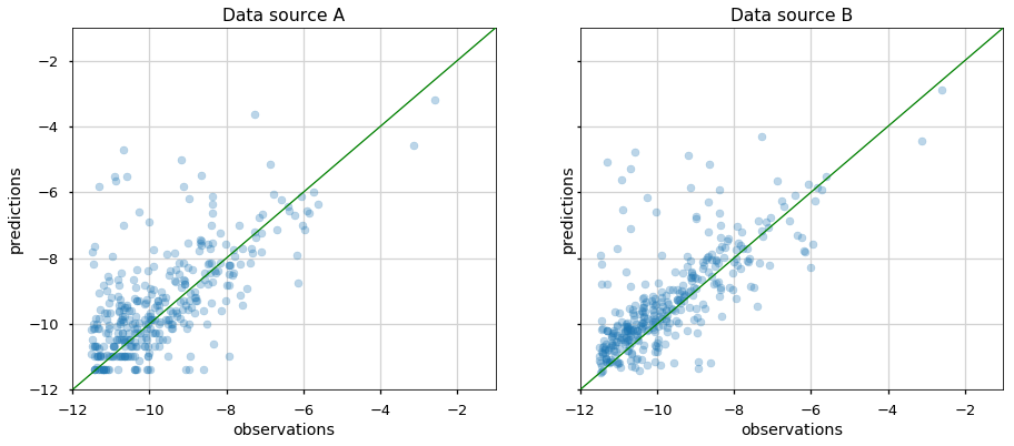
Proposed methods would be examining metrics, for example, the Pearson correlation, Mean Absolute Error (MAE) etc. However, it might not convey the whole story, such as which apps perform better or worse in the new data source (see this blog to be convinced we should not trust metrics alone). We can also plot arrows from data source A to B, but this plot would look pretty dense and be hard to understand:
Using animation might be a good solution. Python matplotlib has out-of-the-box animation capability, and it is pretty straightforward to use them. Using this animation makes it very natural to see how the two data sources affected the predictions.
We could also investigate the two scatter plots using Python mpld3 library. It enables us to zoom, pan, tooltip and brush apps that are of interest, and see their performance in the two data sources. I really like that it integrates almost seamlessly with matplotlib… and we only added seven lines of code!
Analyzing Event Logs made easy with Gantt Chart
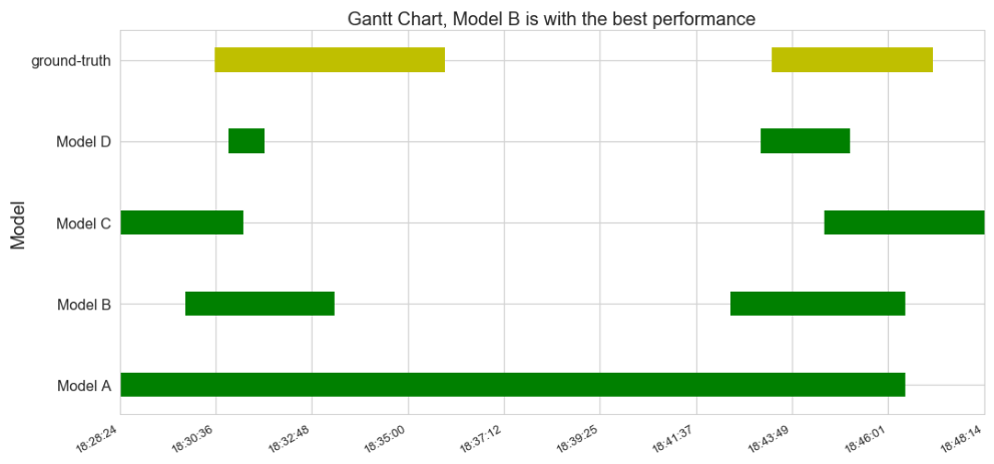
Our task here is to evaluate several models’ performance for predicting user sessions. We are interested to decide which model is the most consistent with the ground-truth. Again, we can think of several metrics for comparing the models, but here the metrics are not very easy to think of since we are comparing time frames.
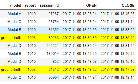
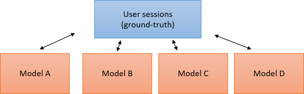
Instead, we should use Gantt chart! Devised a century ago, Gantt chart is a very useful visualization, mainly used to illustrate project schedules and task dependencies. When we compare the four models to the ground-truth, it becomes pretty obvious to see that model B performs the best. Now, Gantt chart has some limitations, such as the ability to plot many models (rows) and for a long time. However, when used wisely, it could be a great chart! The following plot was generated using horizontal bar plot using matplotlib:
Recap
In the beginning of this post, we saw how important it is to have a question at hand before creating any chart. Then, we saw how a valuable visualization is an intuitive visualization and what that should look like. After that, we went over several use cases to emphasize these ideas, while implementing all of the charts using Python’s libraries.
I hope I inspired you to create valuable charts, and convinced you of the power of Python to be your assistant.
References
- Cleveland, W. S., & McGill, R. (1985). Graphical perception and graphical methods for analyzing scientific data. Science, 229, 828-833
- Gantt, H. L. (1913). Work, wages, and profits. Engineering Magazine Co.
- Heer, J., Bostock, M., & Ogievetsky, V. (2010). A tour through the visualization zoo Commun. Acm, 53(6), 59-67
- Snow, J. (1855). On the mode of communication of cholera. John Churchill
About the author:
Shuki Cohen is Data Scientist in the Data Analysis & Algorithms group at SimilarWeb.
He is passionate about all data science aspects, especially Machine Learning, Optimization, Visualization, and Statistics.
Want to make him smile? Shuki is intrigued by smart algorithms that spark human imagination!